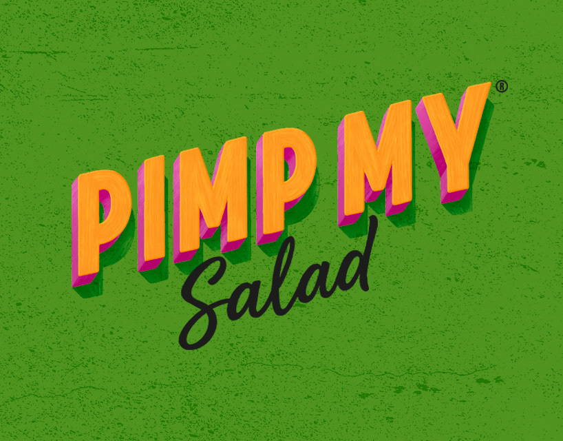
For Google UX Design Certification
Project overview + Timeline
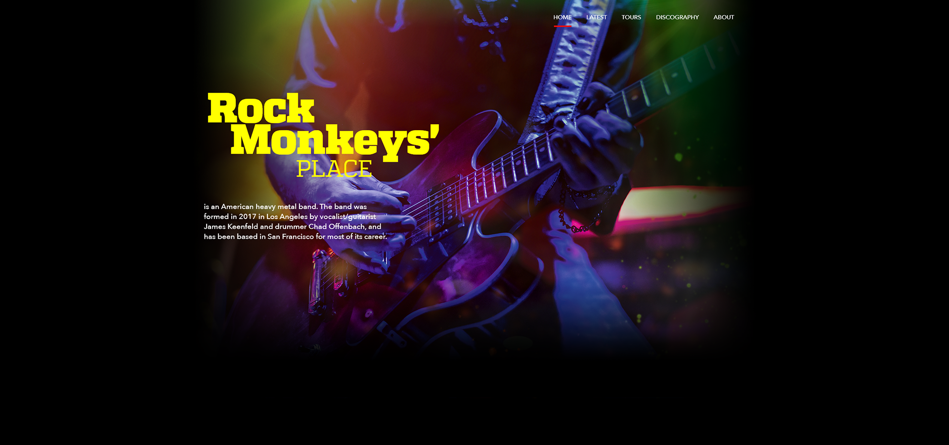
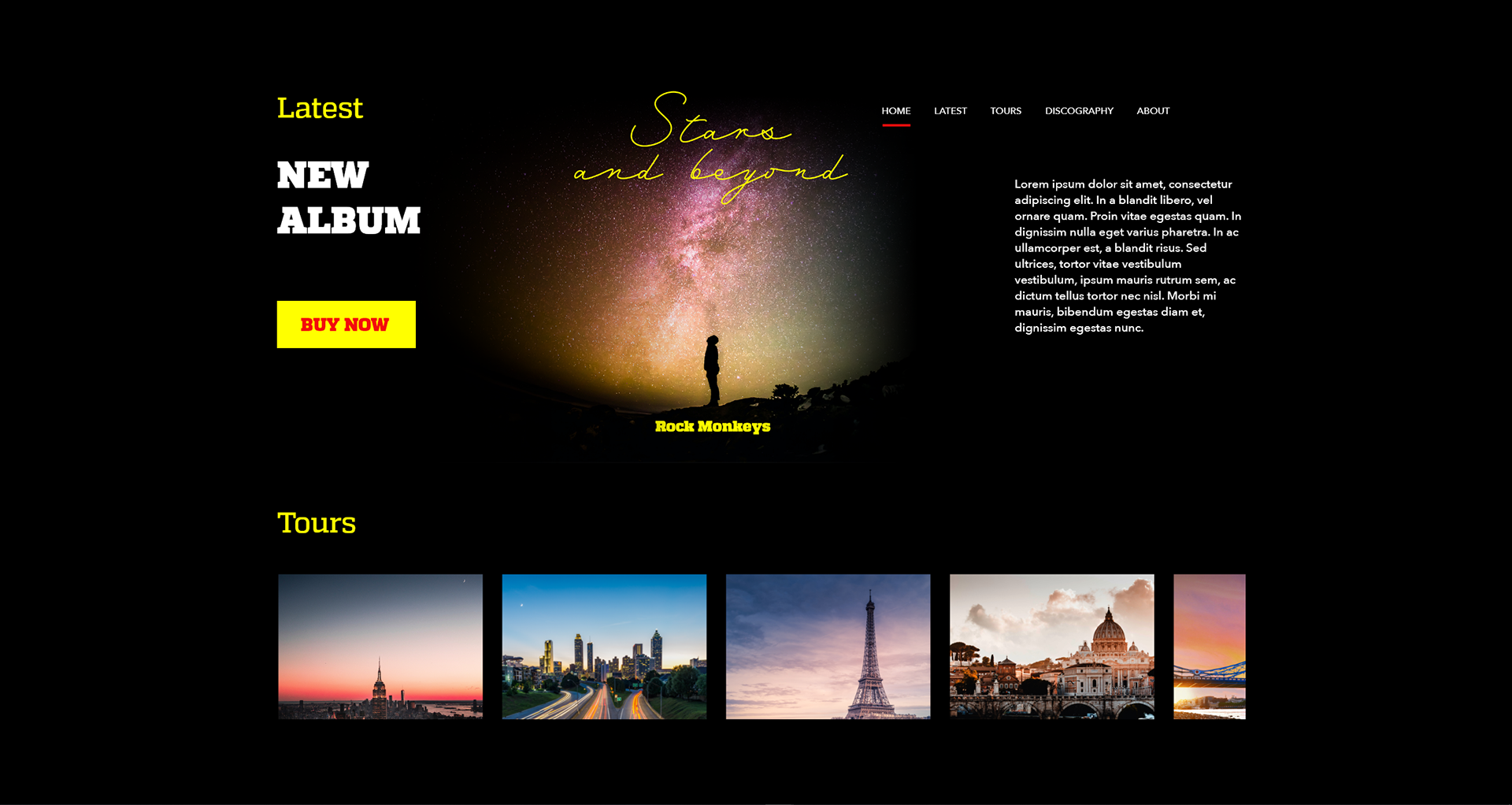
The idea was to create a responsive website for rock band's listeners, who will be able to listen their music from any device and any place.
Also, listerners must have the ability to buy an album, watch videos, get the latest news, order tickets to upcoming tours, etc...
August — October 2021
Problem statement + The Goal
To listen complete album, and/or ordering it from the band’s website. Likes the band and want to listen it everywhere at any device.
Design a website to be user friendly by providing clear navigation and offering a fast listening, reading and checkout processes.
My Role + Responsibilities
UX designer leading website design.
Conducting interviews, paper and digital wireframing, low and high-fidelity prototyping, conducting usability studies, accounting for accessibility, iterating on designs and responsive design.
User research
I conducted user interviews, which I then turned into empathy maps to better understand the target user and their needs. I discovered that many target users are looking for good music listening at any place and any device as a fun and relaxing activity from school or work or a car.
However, many such websites are overwhelming and confusing to navigate, which frustrated many target users. This caused a normally enjoyable experience to become challenging for them, defeating the purpose of relaxation.
Pain points
Navigation + Interaction + Experience
Most of the times users facing problems, like "dont know where to click" or "how to listen". Bad responsivness of site cause problems with mobile devices.
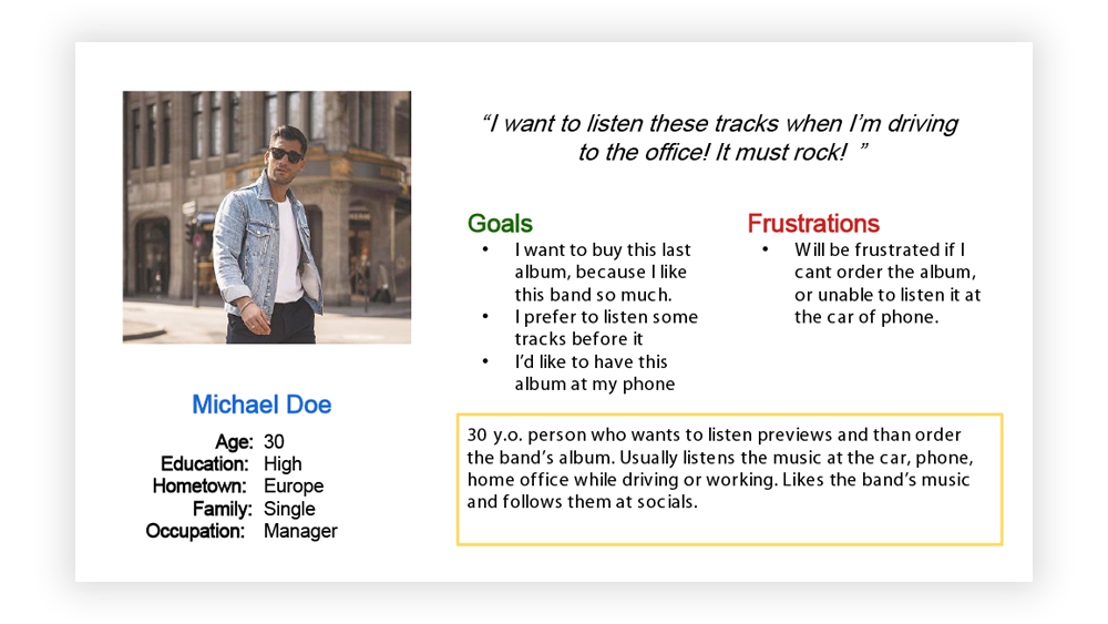
Persona
30 y.o. person who wants to listen previews and than order the band’salbum. Usually listens the music at the car, phone, home office while driving or working. Likes the band’s music and follows them at socials
Design
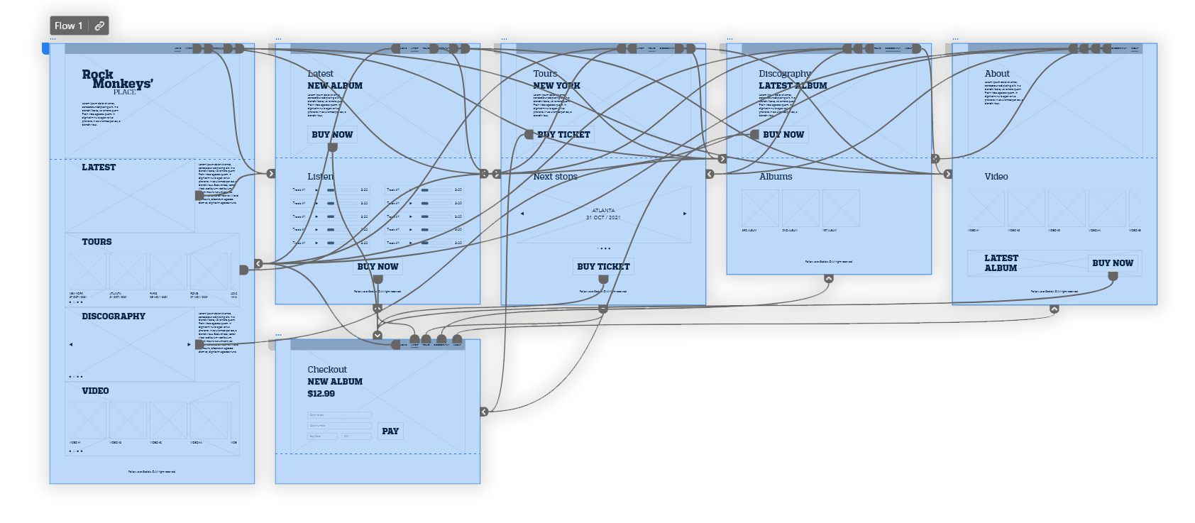
Difficulty with website navigation was a primary pain point for users, so I used that knowledge to create a sitemap.
My goal here was to make strategic information architecture decisions that would improve overall website navigation. The structure I chose was designed to make things simple and easy.
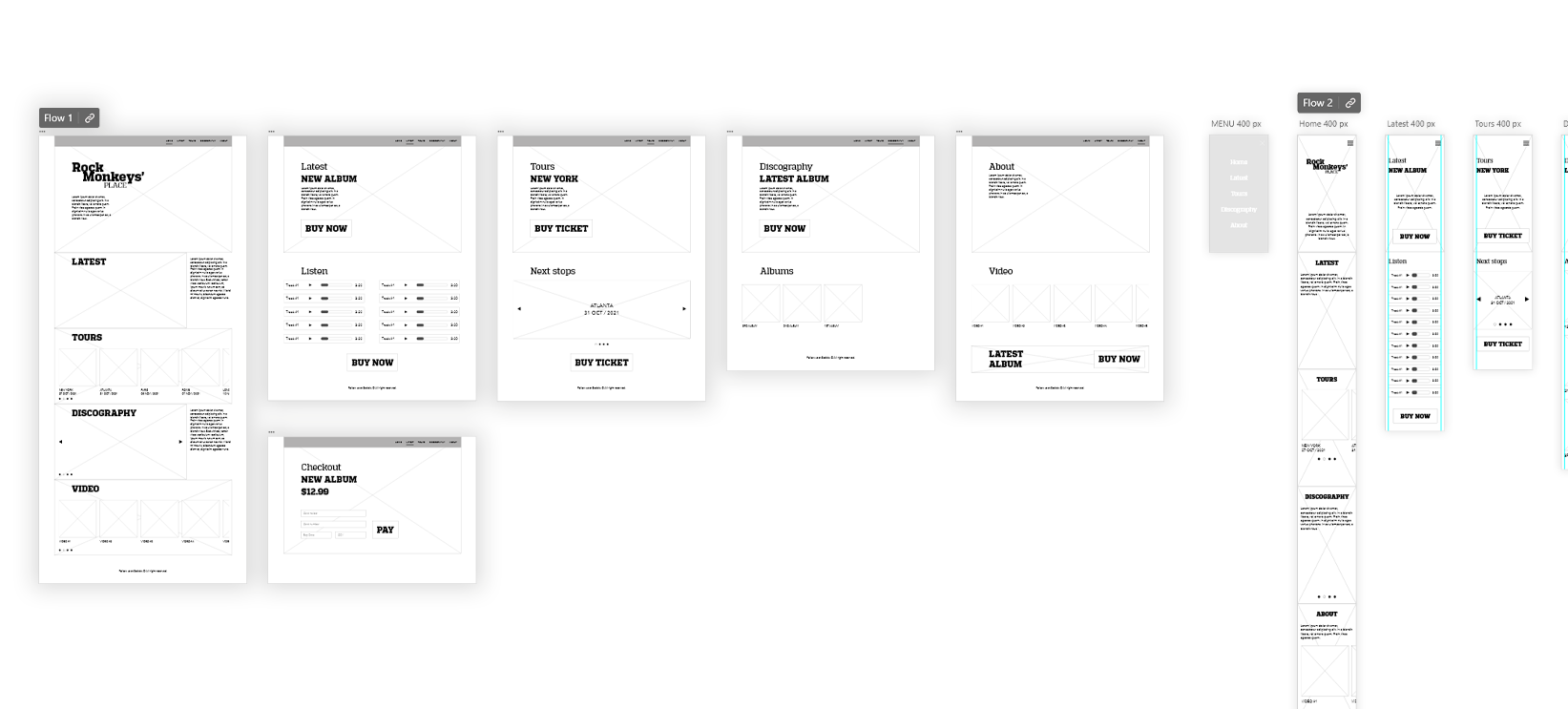
Paper wireframes
Next, I sketched out paper wireframes for each screen in my app, keeping the user pain points about navigation, browsing, and checkout flow in mind. The home screen paper wireframe variations to the right focus on optimizing the browsing experience for users.
Additional layouts for mobile screen size also been made.
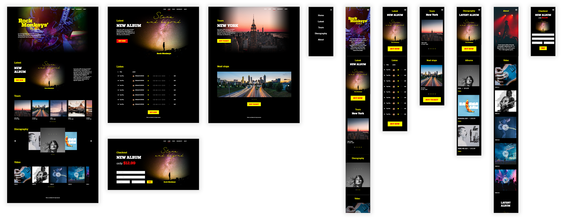
Digital wireframes
Moving from paper to digital wireframes made it easy to understand how the redesign could help address user pain points and improve the user experience.
Low-fidelity prototype
To create a low-fidelity prototype, I connected all of the screens involved in the primary user flow of adding an item to the cart and checking out.
At this point, I had received feedback on my designs from members of my team about things like placement of buttons and page organization. I made sure to listen to their feedback, and I implemented several suggestions in places that addressed user pain points.
After that, been unmoderated usability study, where been found problems at the navigation section.
Mockups
High Fidelity Prototype
My hi-fi prototype followed the same user flow as the lo-fi prototype, and included the design changes made after the usability study, as well as several changes suggested by members of my team.
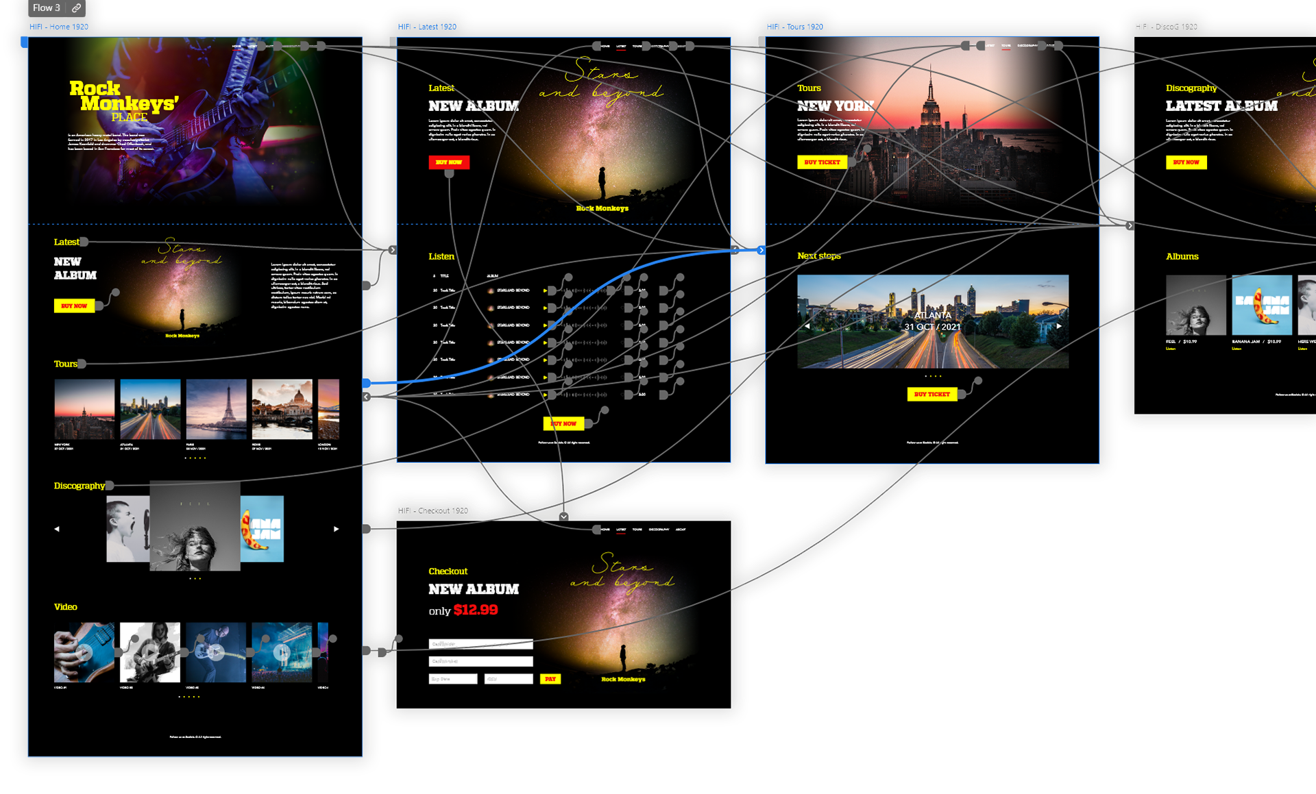
Accessibility considerations
Such as alt texts, icons and different size headings were included.
Thank you for reviewing my work!
If you’d like to see more, or would like to get in touch,
my contact information is provided at this folio.
my contact information is provided at this folio.